YEAR
2016
ROLE
Art Direction, UI/UX Design
PROJECT
E-commerce / Desktop
2 min read
hyde park marketplace
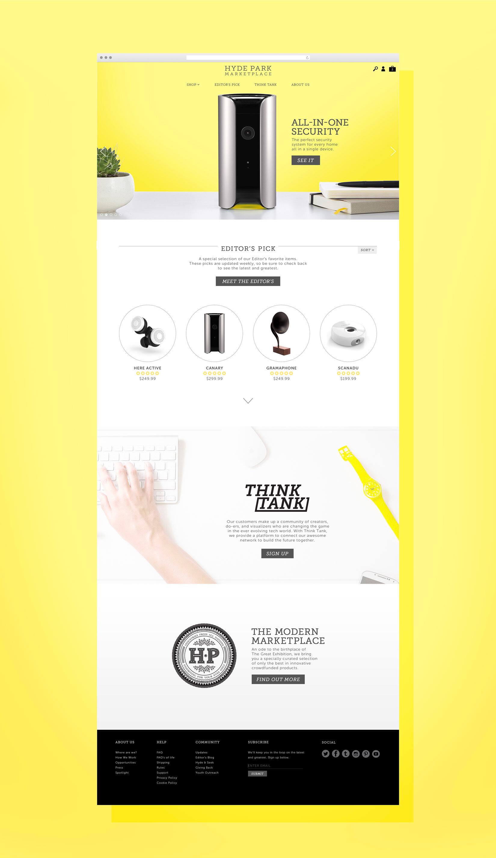
The rise in crowdfunded products has signaled a new wave in consumer tech goods. However, a major issue is getting them to work as advertised. At Hyde Park Marketplace, they do the research for the consumer and only offer products that are actually produced and tested to work.
warm, bold, & friendly
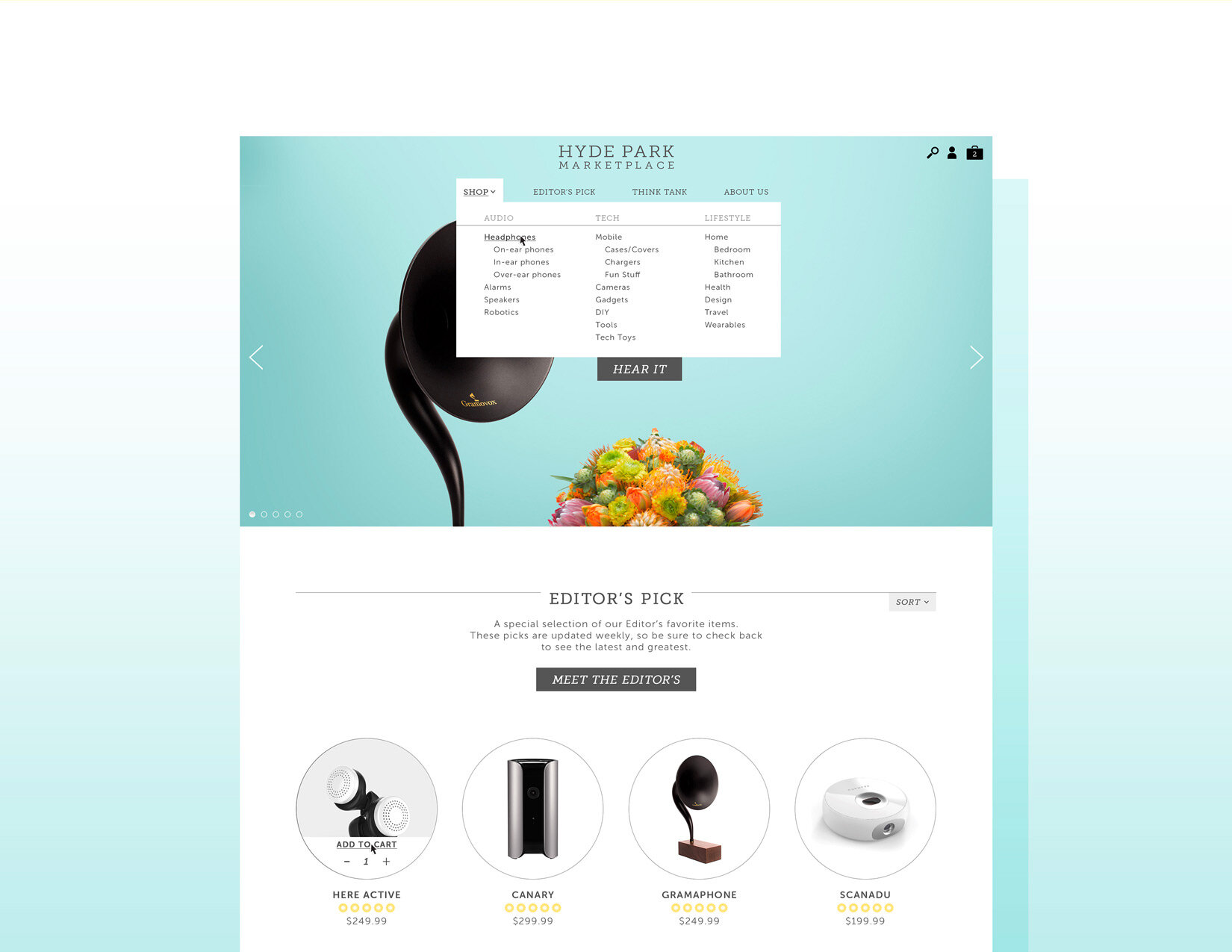
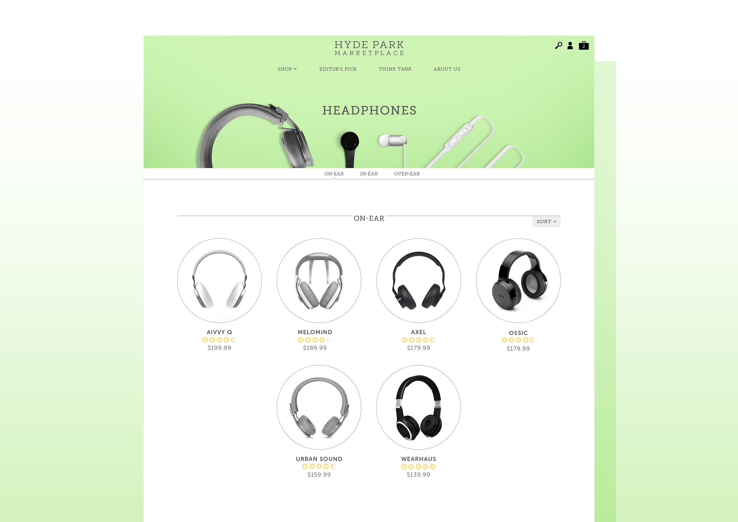
Tech products can seem cold since most are produced using a monochromatic color palette. By using bold warm tones paired with a welcoming font choice gives this tech site a friendly appearance.
down to the wire
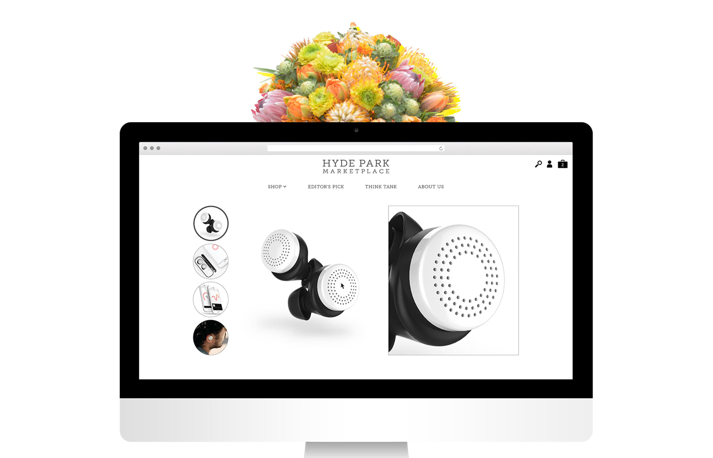
Zoom features and large photos allow the customer to view the products in all their glory. To help the customers purchase with confidence, we've included customer reviews, ratings and an open Q&A.
simple check out
By creating a secure one page check out, we essentially gave back time to the customers. And that's something you can't put a price tag on.
