YEAR
2017-2019
ROLE
Lead Product Designer, UI/UX, Brand Identity & Strategy, Art Direction, Systems Design
PROJECT
EdTech SaaS / Desktop + Mobile
URL
https://learnwithorion.com
5 min read
ORION REBRANDING CASE STUDY
ORION (previously VALT) is a computer-adaptive GMAT program that personalizes a study mission based on users weaknesses. It adapts with every practice test taken, allowing users to know exactly what to do and when. ORION’s mission is to help anyone master new subjects in a fun, efficient, and habit-forming way.

the challenge
Rebrand, rename, and reiterate a newly launched product as efficiently and seamlessly possible.

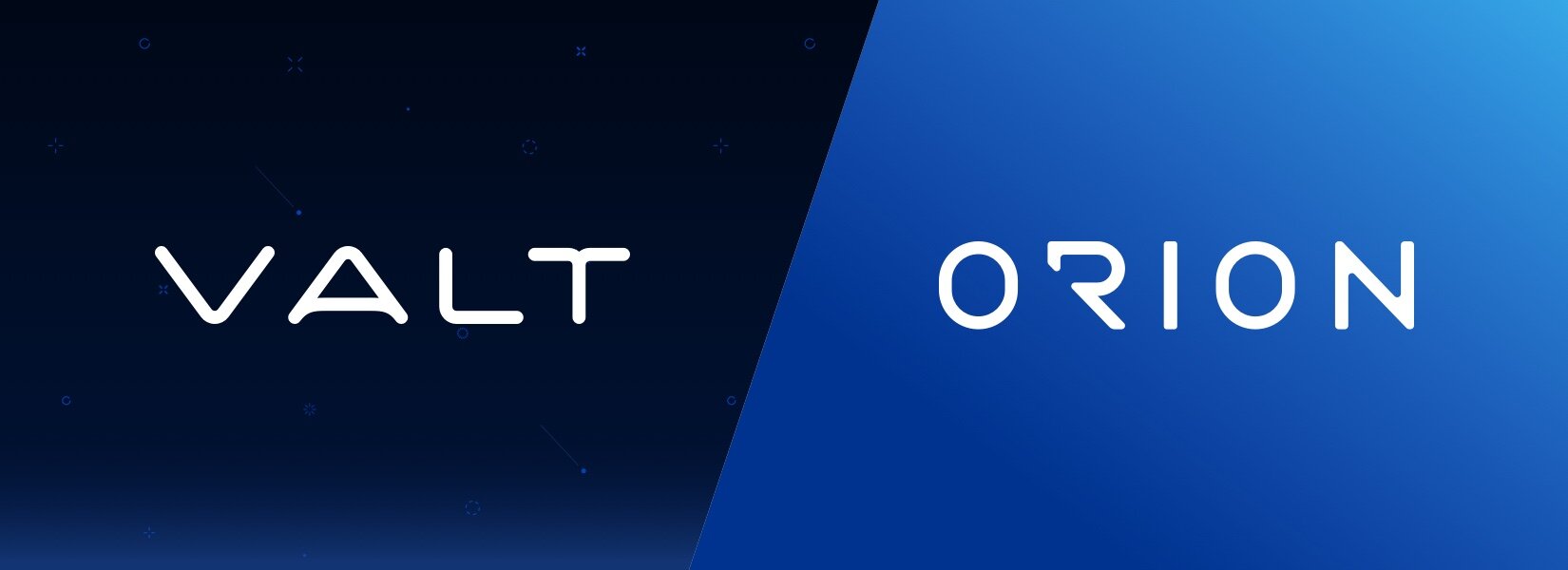
VALT:
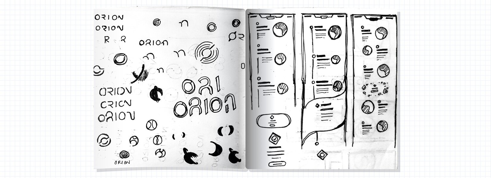
THE ORIGIN STORY
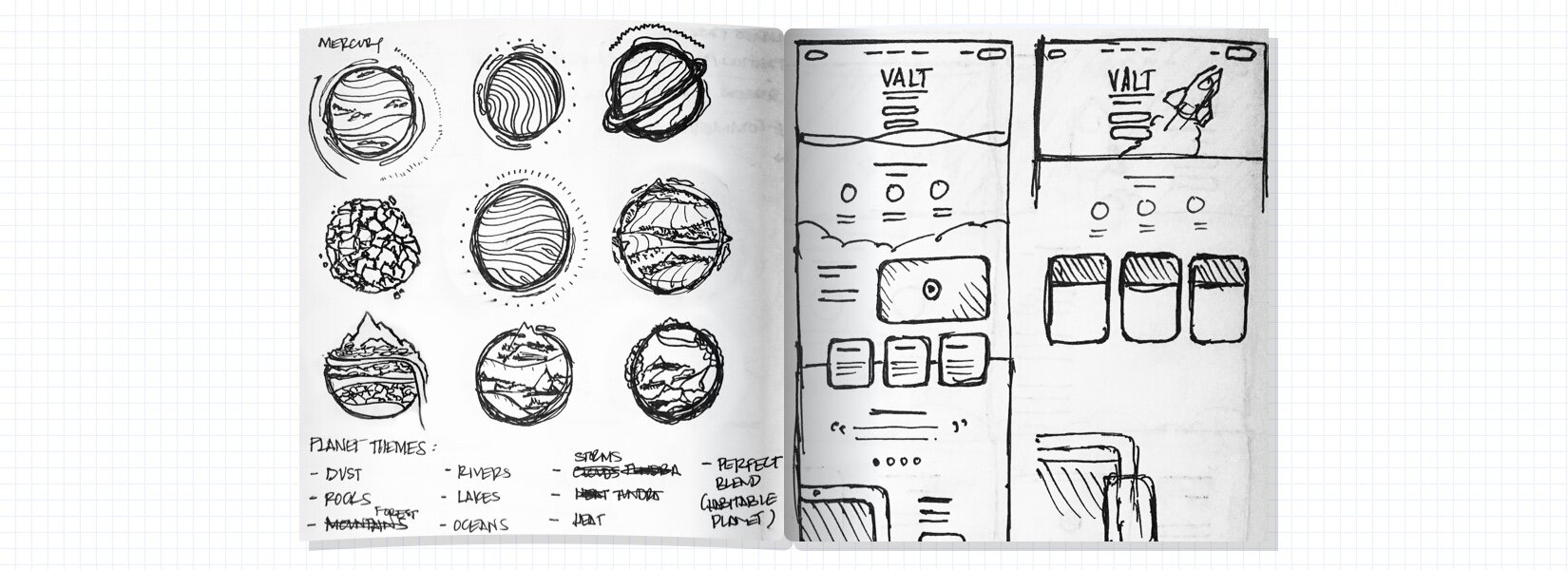
The initial product titled, VALT, was powered by the parent company Veritas Prep, which at the time, was the worlds largest privately-owned test prep and admissions consulting company. After going through rounds of brainstorming sessions, we landed on a space themed brand identity and story. This allowed us to satisfy stakeholder goals in creating a more engaging way for GMAT students to study. With a tight turnaround, we went straight to work by mood boarding brand ideas and building out a high-level view of how VALT would function.
GAMIFICATION RESEARCH
Gathering insights and collaborating with the academics team helped formulate the hierarchy of product features. However, we also needed to figure out how to make studying more efficient and enjoyable. Since the average GMAT test taker is 27 years old with initial scores between 500-600, we began researching useful ways we could integrate gamification elements to enhance the test taking experience.
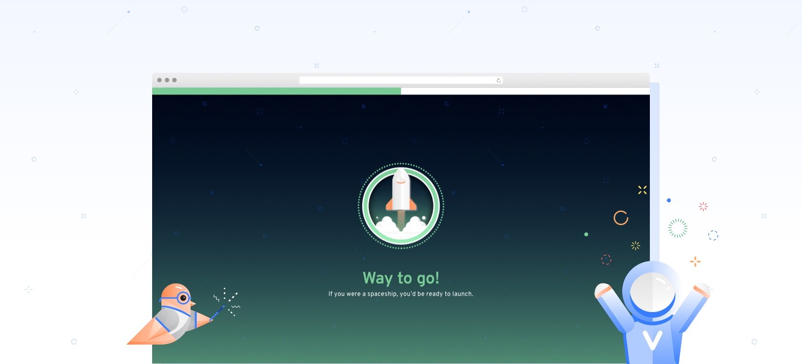
A DOSE OF DOPAMINE
From a closed focus group beta launch, we found that slight hits of dopamine inducing features helped keep our students engaged and motivated while leveling up their scores.
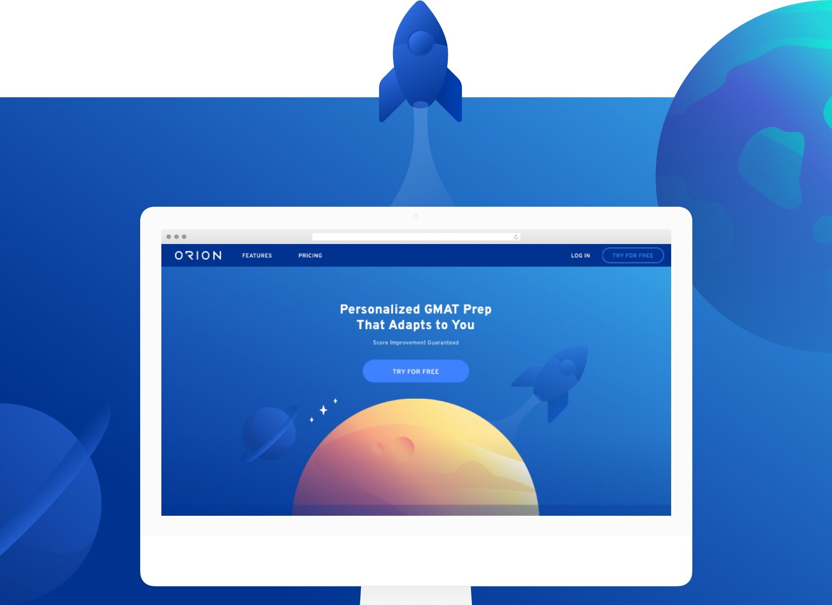
VERSION 1.0
PERSONALIZED, MOTIVATIONAL, & EFFECTIVE
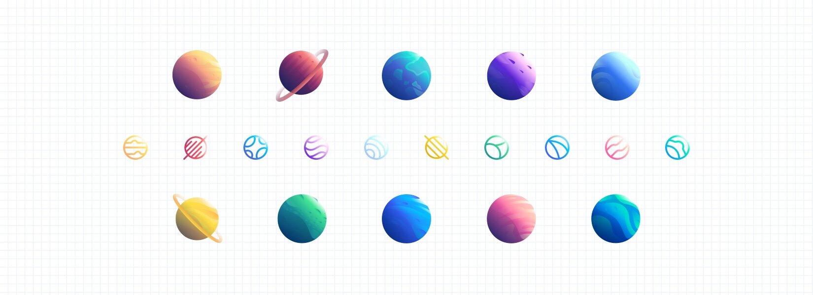
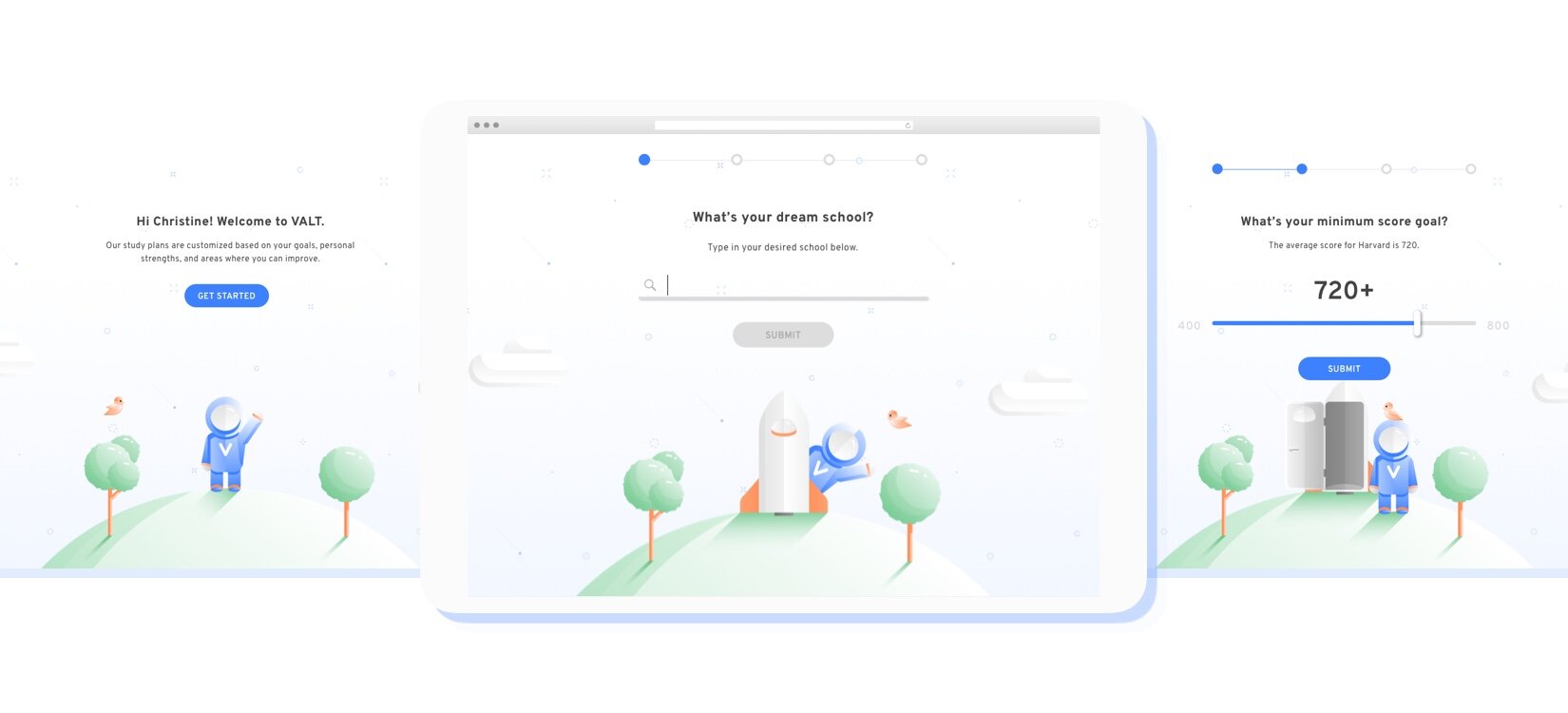
The concept for VALT married the unknowns of outer space with an aesthetic that felt good, nostalgic, and familiar. It led us to develop what was dubbed the VALTiverse, a playful, scalable, and intuitive design ecosystem.
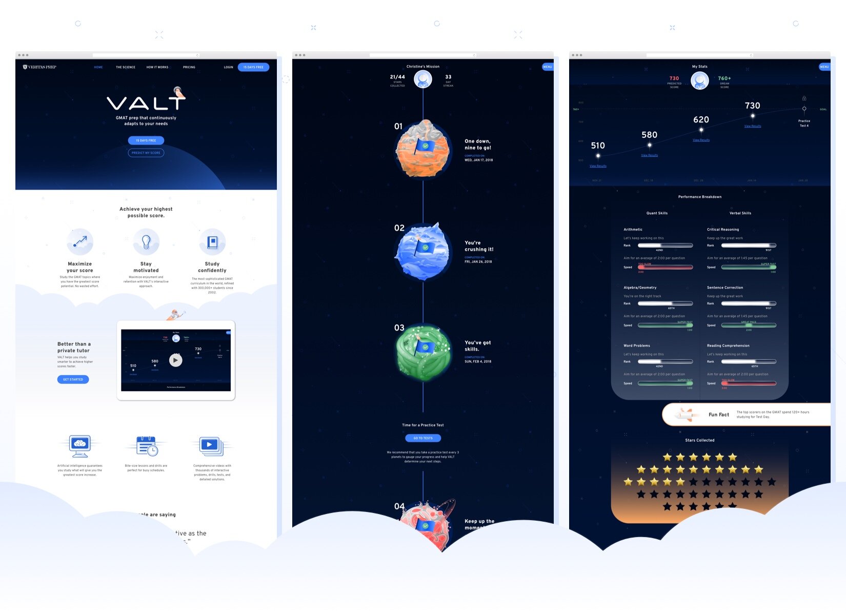
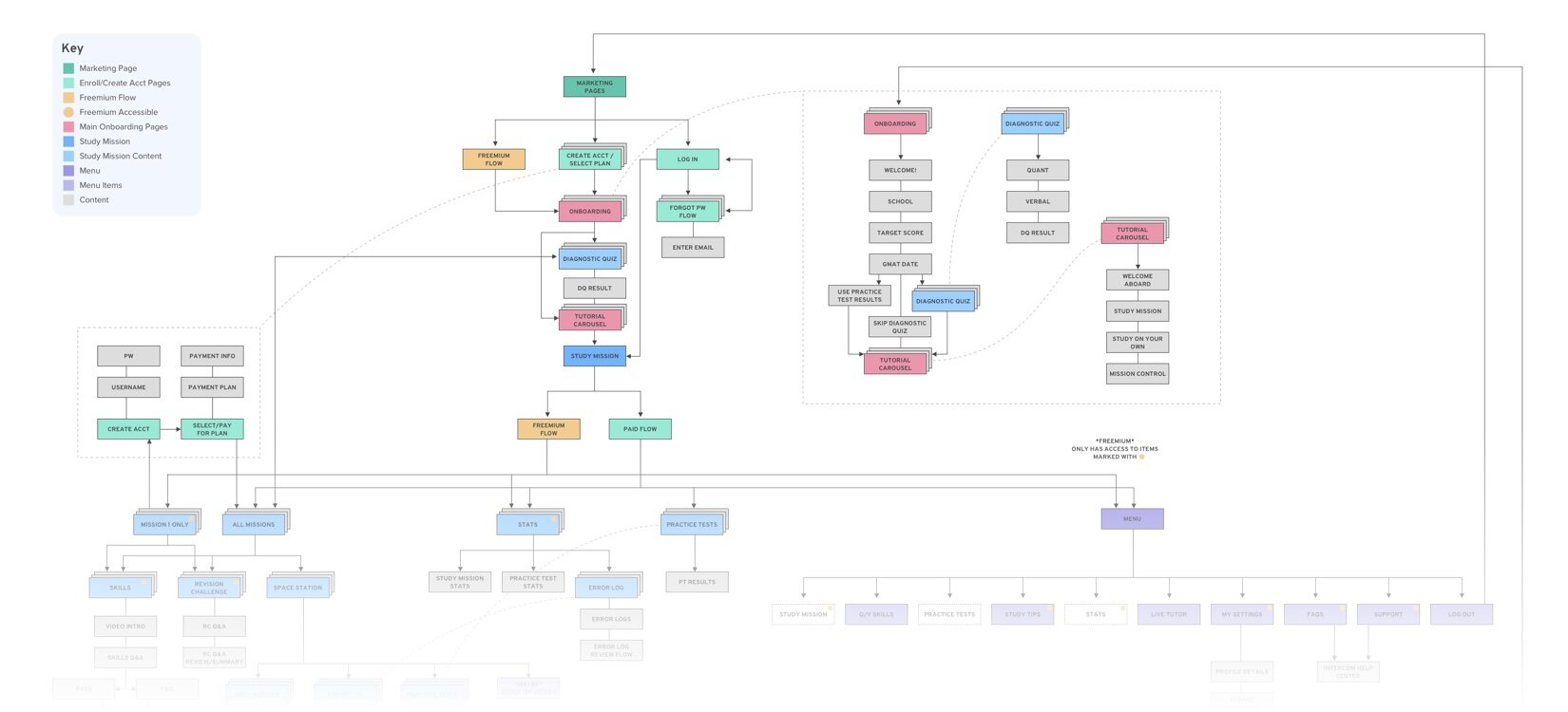
STUDY MISSION
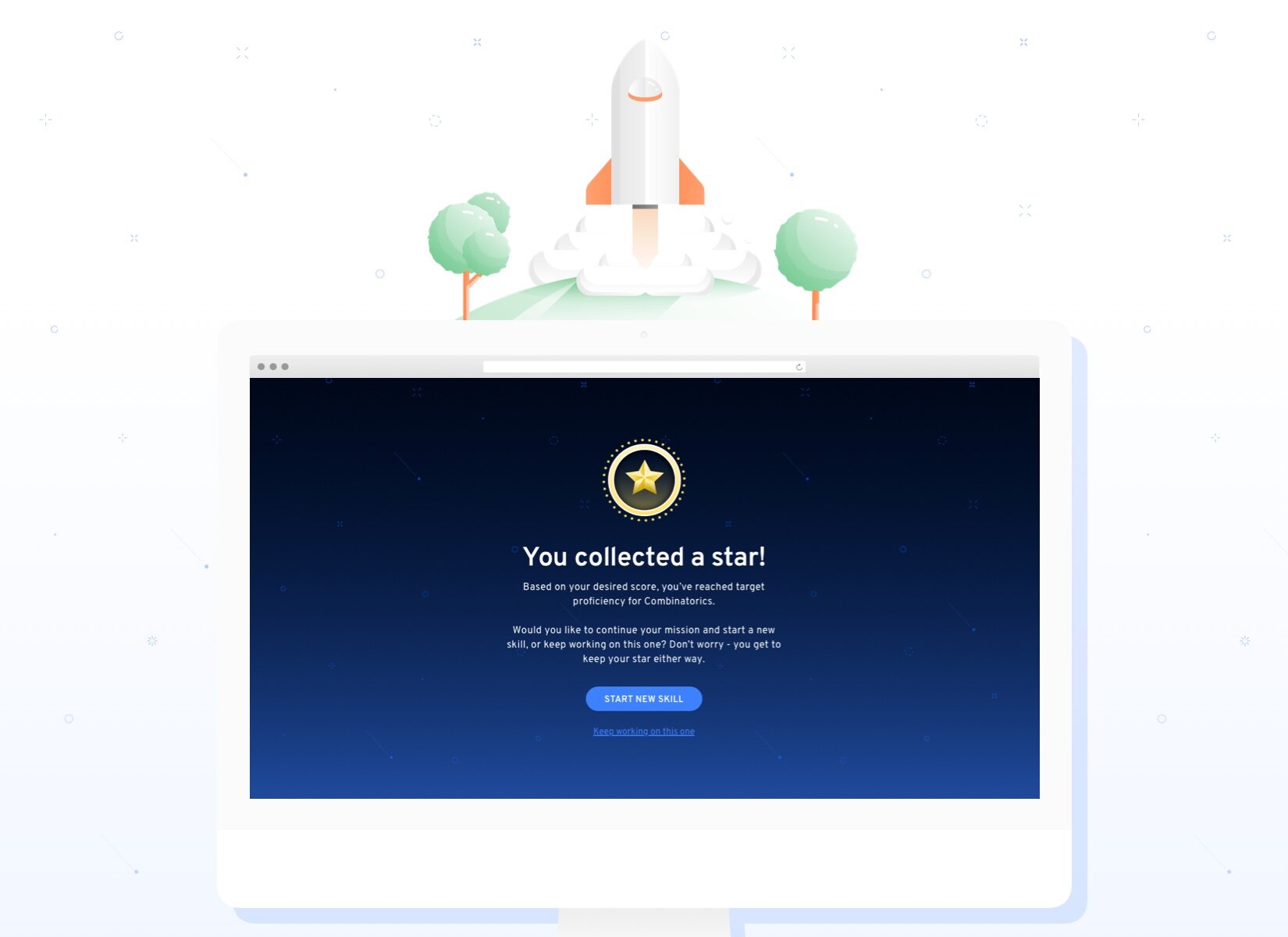
Each study mission consisted of 44 skills — 27 of which were Quant and 17 in the Verbal category. These skills were then dispersed between 10 planets formulated by the results of an initial diagnostic quiz. The goal for our students was to conquer their mission by collecting all the stars from the skills contained in every planet. To collect a star, students needed to pass their goal level on each skill.

INTO THE ABYSS
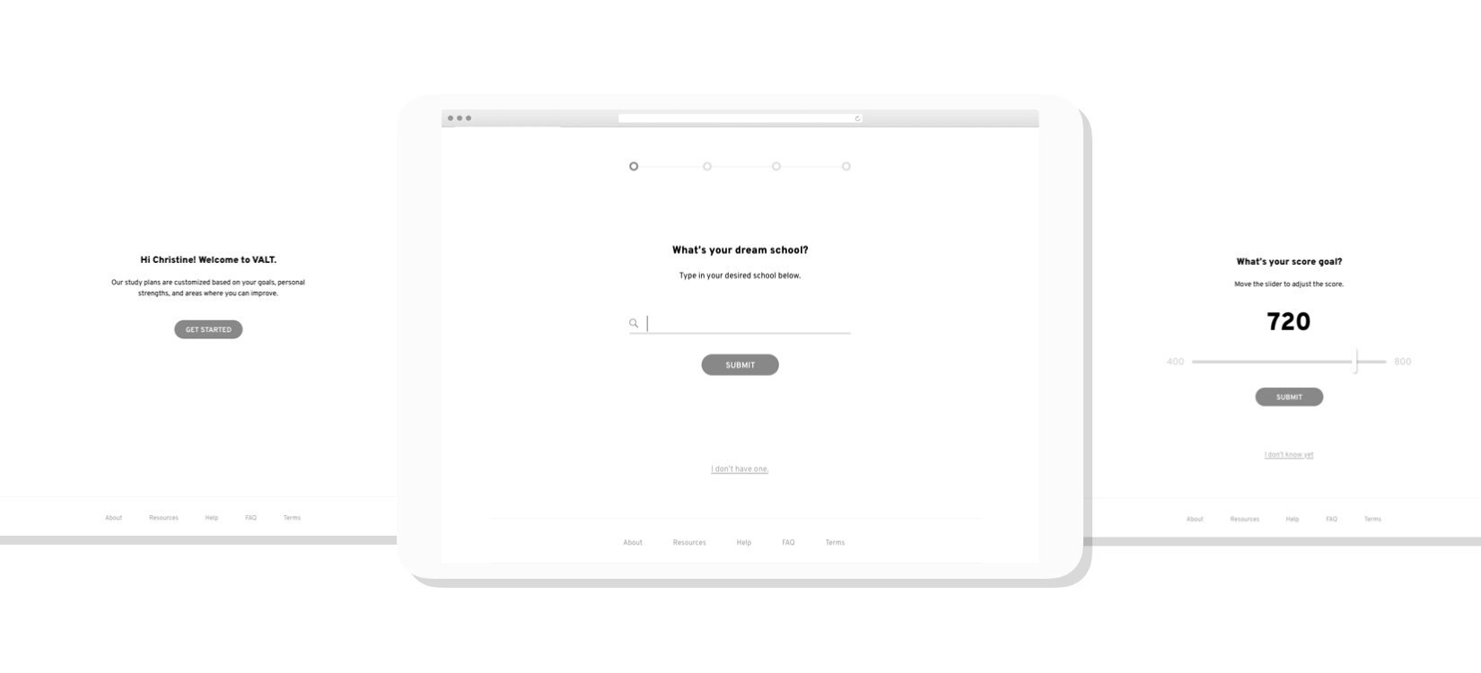
Four months after VALT was launched, it became clear that while the platform was improving our students performance, the brand was not connecting to them. Results from our survey showed users resonated with the gamified interface but thought the visuals and iconography skewed towards kids, was a bit dark, and leaned more on the masculine side.

VERSION 2.0
Approachable, Intelligent, & Unambiguous
Once ORION was announced as the new name, my role was to rework the brand identity and story, modify the current design system, and make use of the existing platform as much as possible. The goal was to reduce the amount of friction between our students and product updates as we rebranded and revised a large portion of the experience.
A GOOD MATCH
Now you’re probably wondering, why ORION? Well, from our surveys and feedback, ORION aligned with our mission to help anyone master new subjects in a fun, efficient, and habit-forming way, while still keeping within the space theme. Additionally, ORION is aspirational, it symbolized growth, and it’s familiar and friendly. The new name allowed us to utilize what we created a mere four months earlier while giving us room to expand and scale our brand. To learn more about our name change, check out our Medium post.
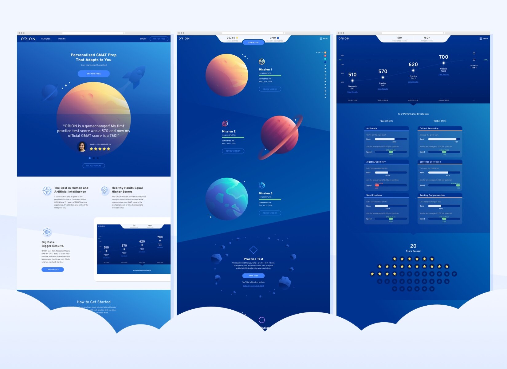
MISSION CONTROL
As we began rolling out the rebrand, we simultaneously worked on product fixes based on feedback from early adopters of the program. We created clear calls to action on how students can get started with their study mission and made a new flow in accessing their skills. We called it ‘Mission Control’, a full screen interaction that contained all of their progress and results for each planet. Additionally, skills became cards that made it easier for students to identify what they needed to tackle next.

100% RECOMMENDED
Once Version 2.0 began rolling out, the response became clear. Students gave us 4.87 out of 5 stars and were engaging with the rebrand and elevated aesthetic. 82% of users surveyed felt the brighter color story and simplified aesthetic felt more relatable and 89% mentioned the updated interface allowed them to engage with the product better than before.

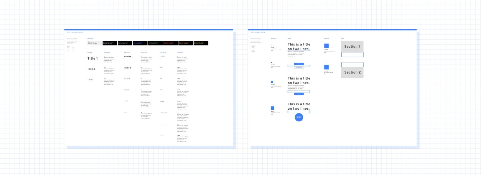
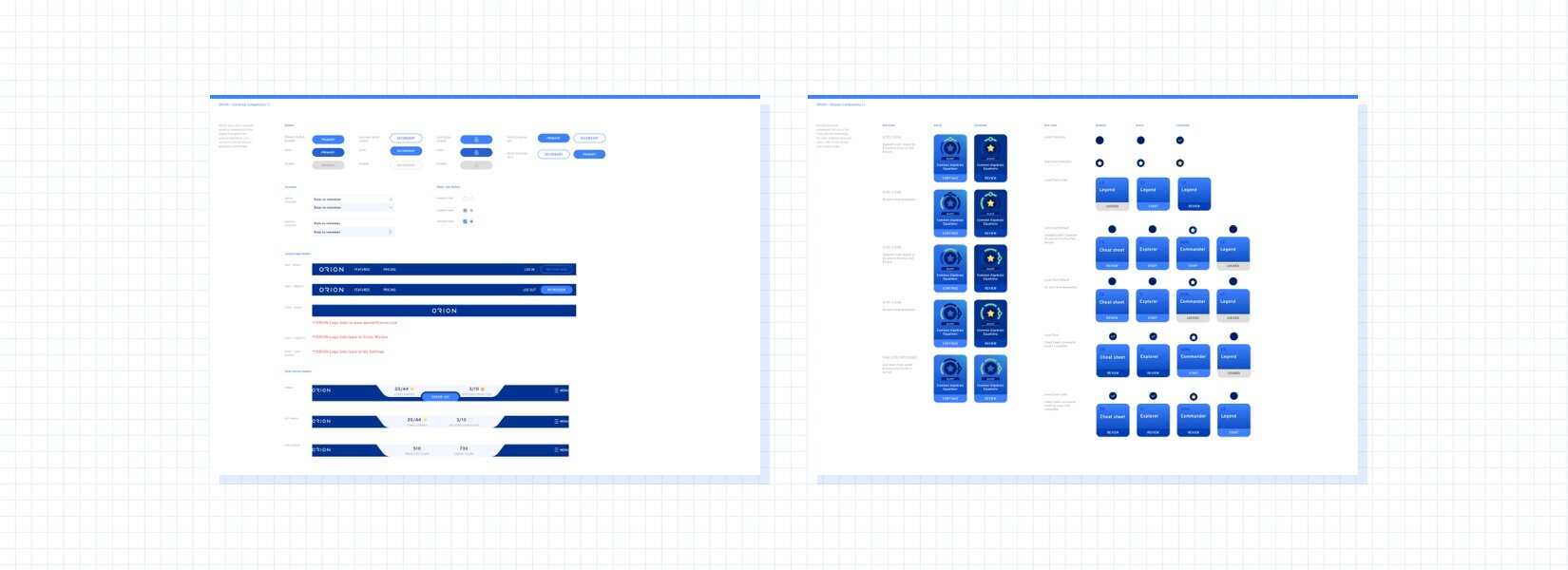
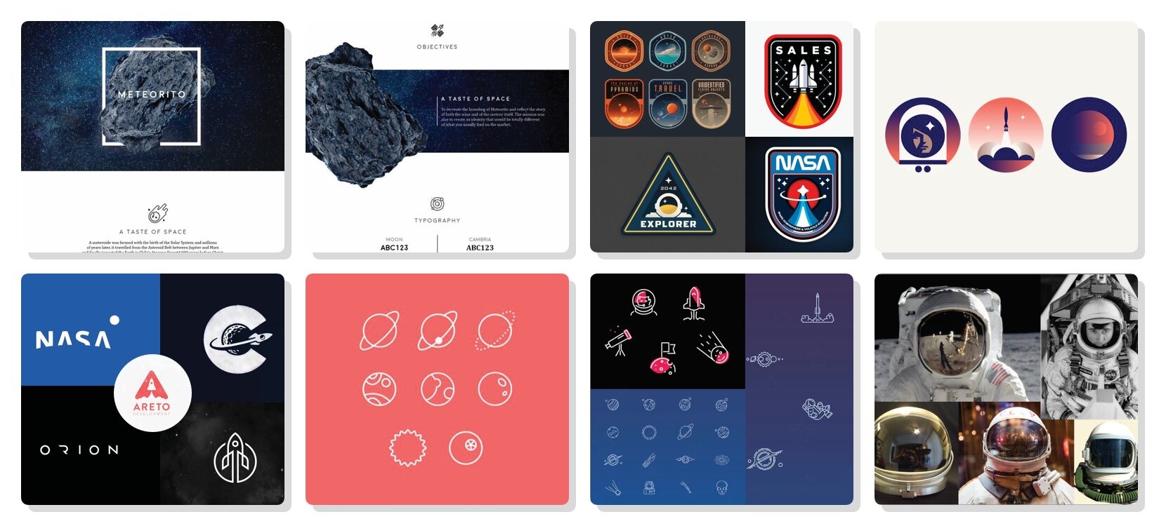
SYSTEM DESIGN & ICONOGRAPHY